Learning
Colour psychology: How do colours affect us at work?
October 07 / 2022
As already reflected in previous articles, the quality of the environment in which a worker performs their task directly affects their productivity. Therefore, it does not depend solely on their personal effort.
Thus, the distribution of space, light or temperature are also fundamental factors for achieving remarkable work. The greater the well-being, the greater the professional results. Betting on the application of colour psychology is one of the strategies that companies use to promote this well-being at work. Its objective is to adapt workspaces to the particular sensitivities of professionals.
Colours at work
Depending on the situation and where we are, we contemplate colours in one way or another. Our personality and mental state also have a lot to do with it.
Therefore, colours for the office must be carefully selected. The goal is to create a pleasant environment for workers. Success will lie in combining them properly until a correct balance is achieved between motivation and calm.
A common reference for many companies is to decorate offices with the corporate colours that make up their brand. It certainly tends to help reinforce workers’ sense of identification and belonging to the company.
However, there are more reasons when choosing one or other colours for offices. Below, we show you some meanings of colours and how they can affect the development of our work activity.
Colour psychology: warm, cool and neutral colours
Warm colours
According to numerous studies carried out, these types of colours tend to create a good atmosphere in the office. Work teams are happier when it comes to carrying out their tasks.
Their biggest problem is that the joy caused generally reduces relaxation. When the concentration of these types of colours is excessive, workers tend to be upset and are prone to distractions. The most important colours within this classification are red, yellow and orange.
Red
A very powerful colour with which you have to be very careful. Its main advantage is that it helps to maintain the energy level in the office. Its most notable drawback is that the excess of this colour can cause stressful situations among the staff.
Yellow
According to colour psychology, yellow boosts creativity. Most creative agencies use it to decorate their offices. It is especially advisable to be present in meeting or team building rooms.
Orange
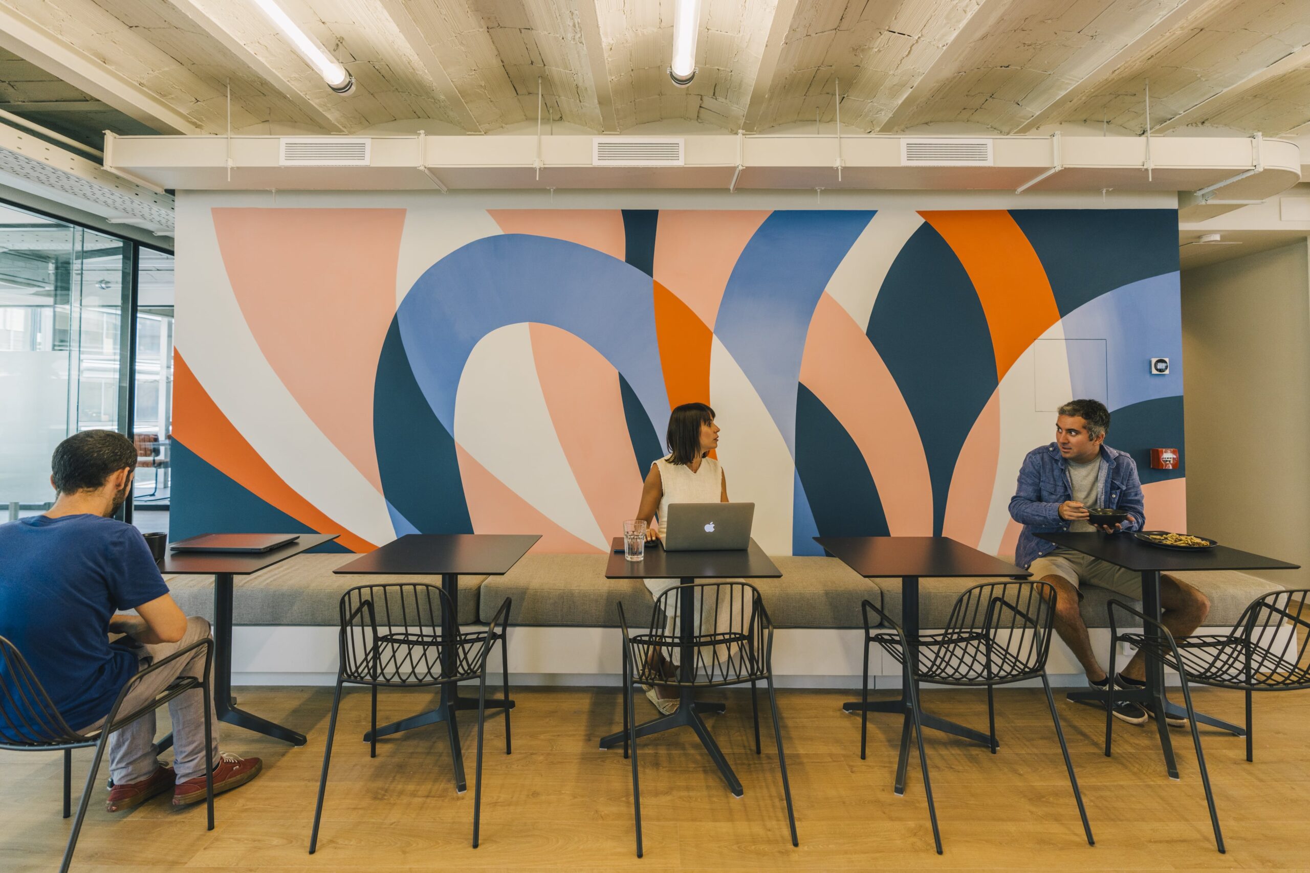
It’s a colour for the office infused with positivity. Unconsciously, workers brighten their spirits and increase their enthusiasm. Orange invites us to interact with others, to interact with colleagues, promoting the positive energy that teamwork radiates.
Cold colours
These types of colours serve to give a feeling of spaciousness and tranquillity. The calm they generate leads professionals to improve their concentration and increase their productivity. The most important colours of this type are:
Blue
It is the colour of tranquillity. Very useful in offices with high workloads and delivery times conducive to continuous tension. The presence of blue keeps professionals calm and boosts trust among team members.
Purple
It is a dark magenta colour, halfway between violet and crimson. It acts as a stimulant of creativity in work groups. According to colour psychology, it is an interesting ally when it comes to creating a positive environment in the office.
Green
It is known all over the world as the colour of hope. It provides security and encourages harmony to be the protagonist in work team meetings. Numerous start-ups introduce it in the decoration of their offices because of the confidence it gives off, thus making it a valuable companion for adventures.
Neutral colours
Included in this group are white, black, in addition to the entire range of greys, which are known as achromatic colours. Let’s see what sensations they convey.
White
In terms of productivity, white does not convey any notable emotion that drives the improvement of work performance. However, among the possible colours for offices, white always conveys spaciousness, professionalism and elegance.
Black
It is usually associated with elegance, power, strength, ability and intelligence. It is the colour most used by high-end brands. With a predominance of black colour, people in the office can perceive a environment of oppression. It is usually used in combination with other colours.
Grey
The decoration of an office with grey transmits a sophisticated, sober and elegant image. Combined with wood and metal materials, it creates truly stimulating workspaces.
Balance, the key to successfully combining colours
Once we know a little about colour psychology, balance is the key concept when it comes to combining colours in our work space. Decorative moderation will succeed in creating an attractive environment for professionals.
Their preferences must also be taken into account. Sometimes you have to avoid a colour because of the negative connotations of a personal nature that it conveys to a worker. In more and more companies, workers, especially in open spaces, are allowed to decorate their own work space. Undoubtedly, an interesting measure to self-generate an environment according to your tastes and likely to improve your productivity.
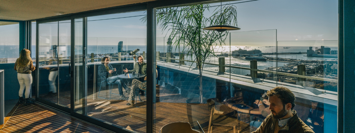
At Cloudworks, we also take care of the decoration of all our workspaces. We always seek to ensure that cloudworkers find the most pleasant environment possible for the development of their activity. We usually have white colours, touches of corporate yellow, blue, green…Visit our website and take a virtual tour of our different locations in Madrid and Barcelona. You’ll be surprised!